Wednesday, 11 December 2013

Magazine cover

Hello fellow internet users.


When creating my magazine cover I used Photoshop. Before I created my magazine cover I needed to find out the measurements for a magazine cover which was 20.88 cm in width and 29.7cm in length.


The first thing thing that I did when making my magazine cover was edit my main focus point. When doing this I used the main picture that I had used in my DVD sleeve. When editing my main picture I used the Magic wand tool to remove the background so that I twas clear to put onto a blank page. once I had scaled my picture to the right size, I then when onto Image, Adjustments then went onto Brightness/ Contrast so that the picture would have more of a dark shine to it. I used colour balance to that I could make the colour of my picture more blue/red.


Once I finished editing my main focus for my magazine cover I then edited the title of my magazine cover. By doing this I used the text tool and used the font Lucida Bright and for the letter C I used the font Future. Then I went onto special effects to give the text a shadow drop. 


Once I edited the title of my magazine cover I then worked on the extra bits of text that I needed for my cover, this is so the audience will know what kind of magazine it is and what you will be able to read inside the magazine. For this I used the font Lucida Grande. I then used Special effects to give the text a shadow drop so that the text did not become lost within the background. 

The final thing that I did when creating my magazine cover was adding a bar code from the corner of the cover. When doing this I needed to scale the bar code to size so that it didn't look too big on my cover. I also taken a picture from Google of the film Home front. Once I scaled the picture to size I then used the paint brush tool and painted the bottom of the picture red so that the american flag become more bold. 


Friday, 29 November 2013

Analysis magazine covers

Hello fellow internet users.

In my blog I am going to be analysing two different magazine covers.


For my first magazine cover I have chosen Empire. In this type of magazine cover you can see that the main focus is in the centre right of the page. It shows a picture of the character Harry Potter with cuts and bruises on his face, this shows the audience that in the next Harry Potter film Harry Potter will be fighting to his death once again.

The main title of this magazine cover is in large red bold writing the type face looks as if it is mirroring the empire state building itself.

In the bottom, left corner you can see I picture of the Wolverine which looks like a scene from the film. On the other corner there is a barcode. This shows you that the reception of this magazine cover is found in supermarkets.

There is text on either side of the main picture telling the audience about the different films that you could read about in the magazine. It also highlights and stars the main film, it also shows you what page you can find the film on. This gives the impact that this film is the magazines best feature and that this magazine will be showing more about Harry Potter than another film.


For my second magazine cover I have chosen Total film This type of magazine cover it is similar to the Empire magazine as the main focus on this magazine is the character Sherlock Holmes. I large writing it shows you the name of the main film that it is showing on this cover. It also shows you in smaller writing underneath the film title a tagline for the movie.

At the very top of the magazine cover it tells you that there are the 10 coolest movies that are being made right now. in the magazine cover Empire it also tells you that they have a massive preview special for the 14 new movie that you need to know about. These two magazine covers are very similar as they have all the same features apart from the title of the magazine cover.

The main title for this magazine cover is in bold capital letters that is placed behind the main picture, where as on the Empire cover the title is placed over the main picture.

This magazine cover have text on either side of its main picture which tells you about the extra, sneaky and the basters that you are able to find when looking inside this magazine.


DVD Sleeve

Hello fellow internet users

When creating my DVD sleeve I used photoshop. Before making my DVD sleeve I needed to find out the measurements from a previous DVD sleeve so that I knew what size to make my template.


Once I measured a previous DVD sleeve I then created my background for my three faces. I did this by using my original picture from my movie poster that I found from Google. To create the background for  the back of my sleeve I used the Rectangular Marquee tool to select the area from the main picture so that I could duplicate the layer. I then rotated the second copy vertically.


Once I finished creating my background for my DVD sleeve I then searched for the different symbols that I needed to put onto my DVD sleeve. For example I needed to put the age certificate onto my sleeve. Before placing the certificate I needed to remove the white background so that it was clear. I did this by using the Magic wand tool, i selected the white background bit by bit to delete it. 


The third thing that I did when creating my DVD sleeve was place the title of my film onto the front and the spine of my sleeve. On the front of my DVD sleeve I have used the original positioning that I have used on my movie poster. When placing my title onto the spine of my sleeve I needed to change the writing to white so that the writing did not disappear within the background. I did this my using the paint brush and painting over it. I then rotated the text and scaled it to size so that I would lie within the spine.


Once I positioned the title of my film I then Placed my main character onto my sleeve. When editing my characters i used the Magic wand tool and selected the white background of my characters. Once I selected the part that I wanted to remove I then Inverted so that it would then remove the background and not the actual picture. Once I had used the Magic wand tool to delete the background I then used the rubber to smoothen the edges and to make sure that I haven't left and parts in the background. 


Once I had finished editing my characters and placed them onto my sleeve I then edited my blurb so that the size and the colour of my blurb didn't become lost in my background so that the audience is able to read it when they turn to the back of my sleeve. I also had to edit the writing of my blurb as I installed the blurb from my colleges learning box. 


Once I finished positioning everything I then wrote out the extra pieces for my DVD sleeve sleeve. I created different shaded boxes from my Special features, the Sound track and for Subtitles that you can get on my DVD. I also wrote out a small description about my film and used the font Futura. 

Thursday, 28 November 2013

DVD sleeve proposal

Hello fellow internet users.

Proposal for Creative media Production Project.

The working title for my DVD sleeve is You can't run but you Kan hide. In my film there will be two main characters called Ben and Kate who are best friends since primary school. In the film you will find out that Ben has an obsessive crush on Kate. He creates a plan to make sure that Kate will never have a boyfriend ever again. On doing this he takes Kate to an old farm shed in the middle of no where. In my working title I have used the letter K instead of a C in the word can, this is used to create an effect to show how twisted Ben actually is. 

The genre of my DVD sleeve is going to be a stalker horror. The reason why I am going with this genre is because the genre is very creative and I was able to thinking about many different idea that I could do for my DVD sleeve.

My target audience for my DVD sleeve would be within the ages of 15-55. The type of sleeve that I am going to be creating will mostly appeal to people that will have a great thrill for being scared. When creating my DVD sleeve I will be reaching out for the younger audience than the older as they will be around the same ages of the main characters which will give them the effect that this could also happen to them, which will create a scarer effect. 

The storyline for my movie poster is going to be about two college students Ben and Kate. Ben and Kate are best friends and have known each other since they were in primary school. As they grow up Ben's crush for Kate becomes more and more obsessive which sends him out of control and insane. This causes him to become highly jealous of the different boys that will come Kate's way. As he becomes more jealous over these boys, he starts to plot ideas on how he could remove Kate so that he can have her all to him self. Ben takes Kate on a camping trim and ends up taking her to an old farm shed which is full of farm equipment and weapons. 

The style that I am going to used when creating my DVD sleeve will be dark, mysterious, foggy, gritty and which have a cold impact towards the audience. For the background of my DVD sleeve I am going to have an old farm shed that I am going to hight from the rest of my sleeve, to show the audience that this is my main setting and that there will be trouble found within these creepy walls. 

What I am going to be thinking about when creating my DVD sleeve in order to not upset social groups. I will be putting an age restriction of 15. This is so that i swill have no complaints from parents of children that will be under aged to watch such graphic pictures and will be too scared. So that I will not be copyrighting I am going to be taking the pictures myself and create the title myself on Illustration. 


Wednesday, 20 November 2013

Movie poster

Hey fellow internet users.


For my final piece I created a stalker horror movie poster called 'You can't run but you kan hide'. The first thing that I did when creating my movie poster was use illustrator to design the outline for my font for the title and the tag line for my poster. The type face that I started off with was 'Times new roman' when making my outline, then once  I had my format I then went onto 'Type' then chose 'Create outlines' When doing this I am about to stretch the surface of the font and curve it into the way that I think suites the name of my poster by clicking onto the blue points and pulling each one bit by bit. 


Then once I had my font ready to put on to my movie poster I then used photoshop to build everything together. The first step that I made was find a background for my movie poster. For my background I went onto Google images and looked up old farm shed. Once I found the right shed for my movie poster I then scaled it to the size of my canvas. 


The second thing that I did when creating my movie poster was taking and choose the right picture of my main character (Kate).  I unlocked the picture so that I was about to edit it, I did this by using the magic wand tool. Then I selected the parts of the picture that I did not want and deleted it bit my bit. Then once I had removed the background of my character I then scaled her to size of my movie poster so that she did not look too big or too small. I also had to place my character so that she looked as if she was running away from the shed.

What I had my background and my main character in place I then went onto the learning box of my college for my blurb. Once I uploaded my blurb to photoshop I then edited the writing to the characters that are playing in my film and edited the names of the director, editor and the film company. Once I finished editing the writing I had to chose the colour of my text so that it didn't become invisible on my background, i also needed to scale it to size so that It didn't look to big. 


DVD Sleeves analysis

Hey fellow internet users.

In my blog I am going to be analysing the different formats for DVD sleeves.

Every dvd sleeve has a purpose, audience , reception and a content. The purpose of the Harry Potter DVD sleeve would be for their target audience to be able to watch the film over and over again. For example if someone has read the books and have seen the film in the cinema they would be a big fan of the films so they might want to by the box set. This type of DVD sleeve is to be used for people who would like to know about about the film before buying their item, it is used as a marketing tool. The audience varies as this film hits every age group for both boys and girls. The age certificate for this DVD sleeve is a 12, it could also be a PG. The reception for this DVD sleeve is supermarkets, rental sores for example Blockbusters. You can can also see this DVD sleeve in holograms, flashes and toys. The contents for the Harry Potter DVD sleeve are movie poster, tag lines, film title, credits, film company, age certificate, blurb, scene pictures, narrative back drop, film captions and a description. 

This is the end DVD sleeve has a purpose, audience, reception and content. The purpose for this DVD sleeve is to package the dvd itself so That it if protected when it is in stores being used as a marketing tool. The target audience for this type of film would be for the ages from 15-35. This film reaches out to people who love comedy and a fantasy world, as it is about the world com,ing to it's end and demands coming above. The reception for this movie poster would be supermarket stores, rental stores and flashes. The content of this movie poster is on two of the faces of this sleeve you see a picture of all the main actors in this film. This movie sleeve also shows the main title 'This is the end' on all three of the faces. It shows the blurb of the film on the back of the sleeve, it also has a small description above the title of the film on the back cover. On the spine of the movie poster it has the logo of the film company and a small print of the DVD logo. At the top of the front cover of the movie sleeve it tells you who is acting in this film.


The film Angus thongs and perfect snogging's DVD sleeve has the purpose of defining the movie as a marketing tool so that their audience and people that have not been able to watch the film in the cinemas to be able to watch over and over again. The audience for this type of movie sleeve would be girls from the ages of 12-25. This film is a stereotypical girl film and the teenage troubles that girls go throw to fit and with look so that boys like them. The reception of this DVD sleeve would be in rental stores like Blockbuster. Also you would be able to film this DVD sleeve in supermarkets or in film magazines. The content of the DVD sleeve is the main picture on the front cover of the sleeve, it shows the main character in the middle of the picture with smaller pictures of her three best friends and the boy she likes on the opposite end with her cat Angus beside her. This movie sleeve as a tag line on the front page with the age certificate on the bottom left corner. In big writing it has the title of the film at the top of the from cover with a kissing print next to it. On the spine of the sleeve it shows the logo of the film company with a small picture underneath of the two main characters. In the centre of the spine it shows you the name of the film and the age certificate of 12 at the bottom. The back cover of the DVD sleeve has a bar code, age certificate, technical information, film company logo and the blurb. It also shows a picture of the main character holding a thong underneath the description of the film with scene shot on the right. In the centre of the page it shows you the special features of the film. 

The difference between DVD sleeves and movie posters are that DVD sleeves have three faces has a movie poster will only have one. On a movie poster it only shows the audience the main feature of the film such as the main picture which would be a link to the film or a picture of the main character of the film. It will also only show the title, blurb, age certificate, film company and tagline, in some movie posters it also shows the names of the main characters.It is also used as a marketing tool so that someone will go and watch the film in the cinemas. In a DVD sleeve it gives the audience more information about the film that you are about to watch. It shows you all of the same thing that a movie poster shows you but also shows you technical information about the film such as how long the film is. It also has a bar code of most DVD sleeves as you will usually find them in superstores and will have to buy it, where as a movie poster you would see them in cinemas for on build boards. 


Wednesday, 16 October 2013

Movie poster Sketches

Hey fellow internet users.

Within my latest post I am going to talk about the three different movie posters that I have sketched out. Each one of these posters are categorised as a Stalker horror.


In this movie poster that I have sketched, I have named it 'The horror behind us'. The reason why I have called this sketch 'The horror behind us' is because I have based this movie poster on a stalker horror. The word 'Horror' and 'Behind' are used for a metaphor of a dangerous stranger. When I do make my movie poster I will make it so that the type face of the word 'Behind' has a blurred effect to give of the impact that when you look behind you, everything from a far becomes blurry as your eyes can not make out images which are long distances away. In my movie poster which is shown above shows an image of an eye that is tangled in the woods, this tells the audiences that the 'Horror' is always watching you where ever you are. 


In the movie poster that is shown above that I have sketched out, I have called it 'He's behind you'  this gives the audience a stereotypical thought on how this film would look like. In the middle of my movie poster I have drawn a strange looking man that has no face, wearing a long black coat. On the right hand corner you can see a hand print. This gives the effect that what ever is behind this man will always start as mystery for the stalker (Man) is always the one that stays behind closed doors. This give the audience the impact to always look behind you when you're alone as even the most keenest stalker will kill you.


In this movie poster that I have sketched out I have called it' You can't run but you kan hide' The reason why I have given the movie poster this name is because I have given it a twisted effect. As in the saying 'You can run but you can't hide' I have changed as in this movie poster there will be two main characters that have been best friends since primary school called Ben and Kate. The character Ben is obsessed with Kate and everything about her, as Kate grows older and starts to have relationships with boys, Ben starts to become more jealous and starts to plot ideas on how he himself could have Kate all to himself. Within this film Ben will plan a camping trip for him and Kate to go on, when they both go out camping Ben ends up taking Kate to an old farm shed which is filled with chainsaws, 22 point riffles, meat cleavers and machete knifes. The reason why I have put 'You can't run' is because When Ben takes Kate into the old farm shed he starts to declare his love to Kate and starts to tell her about his obsession for her and how he's been worrying about that he might lose her because she is rude and a tease and leads on other guys. As Kate starts to panic and realises that the best friend that she has known all her life is not the guy she thought he was as the last chapter of her life has now come in place.


Film poster proposal


Hey fellow internet users.

Proposal for  Creative Media Production Project

Sophie Alysha Masterman
16th October 2013


The working title for my movie poster that I have sketched out is 'You can't run but you Kan hide'. The reason why I have used this as my working title is because in this film there will be two characters called Ben and Kate. Within this film Ben is an obsessive jealous best friend that plots on how he could make sure that Kate will never have a boyfriend ever again so that he can have her all to himself. Ben takes Kate to an old farm shed in the middle of nowhere to make sure that if he can't have Kate then no one can have her. The letter 'K' which is used instead of a 'C' in the word 'Kan' is because it creates a twisted effect to show that the main character Ben is insane. 

The genre of this movie poster that I am creating is Stalker Horror. When analysing the different movie genre posters I came to the decision that I was going to make a Stalker Horror movie poster because of all the different ideas that I have for this category. I thought that this genre would be creative to make an that I was able to make is as scary and creepy looking as possible.

My target audience that I have chosen for my movie poster is ages between 15-55. This type of movie poster would mostly appeal to people that might have thrill by being scared. The age ranting that I am mostly reaching out towards would be 15-25 year old as the main characters in my film would be college children so this would create more of an effect towards them as they are closer to the ages of these character which might create an impact on them that they are these thrilling actors. 

The storyline of this movie poster is Ben and Kate which are best friends that have known each other since Primary school, that are now students in college. As Ben and Kate have grown up knowing each other Kate has never known about Ben's obsessive crush on her, which has coursed him more and more insane about her. He has become highly jealous of any boy that has come anywhere near her in the past and is willing to remove Kate form this worlds so that no one can never come close to her ever again. 

The style of my movie poster is a dark, mysterious, foggy, gritty look, which will give a cold impact on the audience. In the middle of my movie poster I am going to have a picture of an old farm shed as in my film the main setting will be in an old farm shed. 

What I will need to think about in order to not upset social groups would be putting an age restriction of 15, so that there will be no complaints from worried parents that the their children should not be allowed to watch films so terrifying. So that there is no copyright on my poster poster I will be taking picture of old farm sheds myself so that no one can say that that picture has already been used before in something else. I will also edit all of the text which is used on my movie poster. 

Wednesday, 9 October 2013

Different Type Faces


Hey fellow internet users.


Horror
The type face ‘Face your fears’ which is shown above resembles a horrifying film such as Nightmare on elm street as the characters of the type face look as if there is blood dripping off it. This typeface is a very scary looking font that would be usually used to relate to a horror film or maybe Halloween to scare the audience that it appeals to. It has a very gruesome texture towards the writing to create a frightening vibe.


Romance
The type face ‘I love what you do’ which is shown above sends a romantic, loving flirty film for example Valentines Day. This kind of font replaces the character ‘O’ with the shape of a love heart to symbolise love and affection. It is a girly style of font that would attract more girls than boys if a film used this style of font.


Action
The type face ‘Stencil style new’ that is shown above suggests to the audience that this style of font could interact with a film such as ‘Hit man’. The style of this font and the shape is very bold and looks masculine, which makes gives of a fierce look upon it. The texture that is used within this type face is very gritty and rough.

Sci-fi
The typeface ‘Transformer’ which is shown above could represent a film that relates to the film ‘Alien VS Predator’ this is because of the alien style font that signifies that this typeface would make the audience feel like they would be in the middle of a galactic battle.  

Historical Drama
The type face ‘Pauls gothic curls’ shown above is a historical style of font that would relate to a film such as ‘Shakespeare in love’. The shape and style symbolises a fairy tale love affair, this could make the audience feel like they are in a dramatic drama with much mystery and intense senses. 

Thank you for reading my blog,
I will be back soon blogging my fellow internet users.
I hope you Enjoyed reading. 

Sunday, 22 September 2013

Film poster's analysis

Hey fellow internet users.
My post is going to be about the three different movie posters that I have analysed called "She's the Man", "The Conjuring" and "Mr & Mrs Smith". I have chosen these film posters because of the different categories Comedy, Horror and Action.


The title of this movie poster is "She's the Man"  this links in with the main picture on this poster as it tells you that a teenage girl would be dressing up as a school boy. In this picture it shows the boy/girl putting his finger up to his/hers face so this would tell the audience that they are now part of a secret and that no one knows about this new identity that she has taken.

The colours that they have used in this movie poster are pink and blue. They have used the stereotypical colours to signify the different genders of the teenager.

In this movie poster the teenage girl and her secret identity have been enlarged and put to the front on the poster to tell the audience that she is the main character and she is here to play no games as she fools the four smaller people that are shown much smaller than this teenage girl  that she is a boy.

The props that they have used in this movie poster are a football and a mirror. The girl that is looking at her self in the mirror would show that she in the queen bee, that she might be the popular girl at the school and all the boys fancy her. The boy that is spinning the football on his finger shows the audience that this boy is going to be the sporty guy through out this film, as his top is off this could show you that he might be very big headed about his body.

The title of this movie poster is "The Conjuring" the word conjure mean something appearing from no where unexpectedly as if it was done by magic. This tells the audience that this film will be about the unbelievable.
In the movie poster there is a woman in a rocking chair holding a doll which is staring towards the audience in a dark squared room as if there is no escaping. This shows that this film is going to be able an old woman and her doll. As the title of the film is "The Conjuring" maybe the old woman in the rocking chair might take over the dolls body as she a demonic demand as she cannot escape from this dark room that she is put in. 

They have used no tag lines or slogans in this movie poster as the picture talks for it's self. On the top of this movie poster in small writing it tells you this the film is the same directors from Saw and Insidious. This tell the audience that this film will be scary and will have capacities and spiritual demons.


The title of this movie poster is "Mr & Mrs Smith" This automatically tells the audience that this film is going to be about a married couple. The font of this title is sleek to show that the couple are very powerful people.
In this movie poster you see a picture of two people 'husband and wife' leaning on opposite sides as if on a wall. 

The husband in this picture is wearing a suit as if to say that he a well thought of man and that he has business to tend to. The prop that he is holding in his hand is a silver gun. This shows you that he could either be a dangerous man or he is a detective. 

The wife in this movie poster is wearing a slim fitting black dress with a slit to show off her sexy legs as she is a young elegant woman, which also shows of the small gun that is tighed to her left leg. This shows the audience that this woman could be a dangerous woman and is out for the kill as her facial expressions are fierce as if she's not impressed with what she see's. The small silver gun which is tighed to her left leg tells the audience that the couple maybe against each other or are agents that work together. 


Thank you for reading my blog. 
I will be back soon. 

Friday, 20 September 2013

Creating a CD album

Hello fellow internet users.


When creating my own CD album  I first went onto my colleges learning box to collect images of a trumpet, CD and music notes. When editing my CD album I used Photoshop. Within using Photoshop I open these different images into three different layers so that I could easily remove their background by using the tool bar, when doing this I first selected the image that I wanted and scrolled onto 'Select' then I clicked on 'Color Range' by doing this I was able to chose which parts of the image that I wanted to remove.

Then once I removed each background from my images I then scaled the pictures to size and positioned them into the places of my canvas that I thought looked right. I did this by going onto 'Edit', 'Transform' then selected 'Scale'. I was also able to make my images rotate by hovering over the corners of my image until a curved arrow appeared.

Once I positioned my images I needed to think of a name to call my CD album which is 'Notes Of The Horn' I did this by selecting the 'Text' Tool I then chosen which format that I thought would suite the name that I have given it.

Once I had put every thing in it's place I used the 'Effects' tool so that I could brighten up my images and also give them an 180% shadow. I also used the paint tool so that I could create a rainbow effect coming out of the trumpet.

Expendables Poster

Hello fellow internet users.


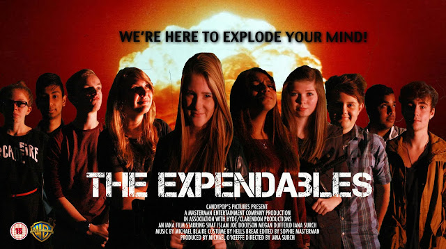
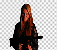
When creating my own poster on The Expendables, me and my creative media class at Hyde Clarendon Sixth form College took pictures of ourselves using the green screen so that it was much easier to remove the background when editing the pictures together on Photoshop.

When removing the green screen from the background I used the Magnetic Lasso tools and inverted the image so that I could delete the back ground. I had also when onto Select on the tool bar on the top of the screen and then went onto Color Range, used the shift button and the mouse to choose which parts of the background that I would like to get rid of. I also used the same techniques when editing the age certificate and the Warner Bro's logo onto the poster.


The next thing that I did when creating a movie poster was finding which font I thought wold work best for the theme of The Expendables. I did this by using the website Dafont. The font that I had used was called Capture It.


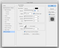
When I had finished placing all of the people that is shown above on my poster into order I had to think of a tag like that would attract the audience was to watch The Expendables. I used the font Charcoal CY I sized it so it was 80pt and use the effect by clicking onto fx which is in the corner of the bottom right hand corner, and scrolled down to Drop Shadow so that it would make the text stand out more from the background.
  

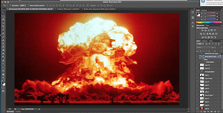
Once I had finished editing the text and placing each picture I went onto Google Images to find a picture of an explosion so that I would create more of a war zone effect. I enlarged to picture so that it would fit the whole canvas, I did this by using the tool bar at the top and selecting Edit, transform and then Scale so that my image would not become blurry when bigger.


When I knew that all my editing was done I when onto my colleges learning box to find the Blurb for my poster. one I had transferred the blurb from the learning box to Photoshop I edited the writing by using the Text tool and selecting the writing so that I could edit what I wanted to act, produce, edit and the production.